Human beings are visual creatures. We process information and make decisions based on what we see. Data visualization, the graphical representation of information and data, makes complex data more accessible, understandable, and usable. This article will explore one of these graphical tools: the donut chart.
Table of Contents
Unpacking the Basics of Donut Charts
A donut chart is a pie chart with an area in the center removed. Like its relative, the pie chart, a donut chart visually represents data proportions in a circular format, helping viewers to understand the component parts of a whole. The hole in the center of the donut chart provides additional space for information and enhances its visual appeal.
Donut charts are excellent for displaying ratios or proportions of information, especially when the total of the data is meaningful. By simplifying complex data into a visual form, these charts allow viewers to understand relationships and see trends between data segments easily.
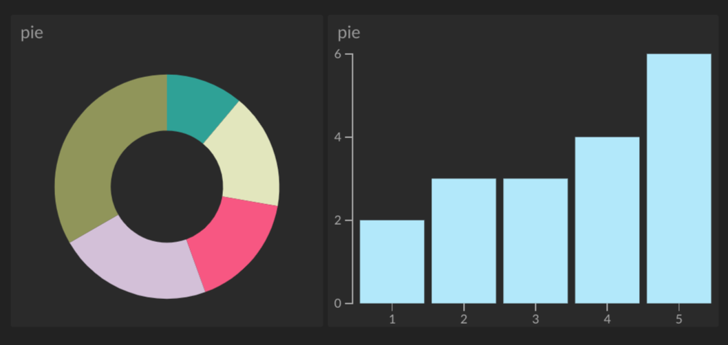
Comparing Donut Charts To Other Data Visualization Tools
Donut charts, like other data visualization tools, have their strengths and weaknesses. They excel at displaying percentage or proportional data, especially when fewer segments are involved. However, unlike bar graphs or line charts, they are not ideal for representing changes over time or comparing individual categories.
While bar charts provide an easy view for comparing individual categories, donut charts shine in showing part-to-whole relationships. Unlike scatter plots that display correlations between variables, donut charts are perfect for data that doesn’t involve a correlation.
Despite some similarities with pie charts, donut charts are often considered to have a slight advantage due to their cleaner aesthetic. The donut chart’s inner space allows for the placement of additional information. Furthermore, many find donut charts to be more attractive and modern-looking.
When choosing between data visualization tools, the nature of the data at hand, the purpose of the visualization, and the expected audience should all be considered.
Application Scenarios for Donut Charts in Business and Research
Many types of business and research scenarios can benefit from using donut charts. For project managers, these charts can illustrate the proportion of tasks completed, making it easy to understand project progress at a glance. Likewise, for sales teams, a donut chart can help to visualize sales figures by product category.
In academic research, donut charts have been utilized to depict survey responses, demographic data, division of resources, and much more. In general, any scenario where the presentation of a whole and its constituents is beneficial can use donut charts.
Crafting a Donut Chart: Essential Steps and Guidelines
Alt text: A person looking at a computer screen with a donut chart, sitting at a white table.
An effective donut chart should be designed with clarity and simplicity in mind. The first step involves identifying the data to be visualized and ensuring it is suitable for a donut chart. This typically means there are clear components that make up a whole, and their relative sizes or proportions are meaningful.
Next, the data should be accurately translated into a chart. The data segments must be proportionate to their actual values, as misrepresented proportions can lead to misinterpretation of data. Color coding should be used to distinguish between different segments, with lighter tones often used to indicate smaller segments and darker ones for larger segments.
Sufficient labeling is also necessary for viewers to understand what each segment represents. Keep the text concise when labeling, and consider using a legend to avoid cluttering the chart. Use the donut’s center to include additional relevant information or summary if necessary.
Using donut charts provides a visually appealing and effective way of communicating complex data.